The Most Important Economic Stories of 2013—in 44 Graphs
A record year for stocks. A meh year for wages. A weird year for Wall Street.
Maybe it's just me, but the last few years are getting tough to tell apart. Imagine a quiz question:
Name that year where we threw obstacles in the recovery's way, but kept growing slowly; where Europe avoided both a disaster and a solution to its mess; and where China kept growing over 7 percent, but didn't rebalance its economy like it said it wants.
You'd be right to guess 2013. You'd also be right to guess 2012, 2011, or 2010.
So, to remind ourselves what did change in the last 12 months, we asked our favorite economists, journalists, and think-tankers for their favorite charts of the year. The stock market went on a tear, the labor market didn't, and Wall Street and Main Street came to terms with a New Normal. Without further ado, here are 37,000 words worth of charts to tell the most important stories of 2013.
The Year in Wages and Wealth: Stocks Up, Paychecks Flat
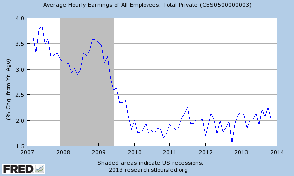
Ryan Avent, The Economist: The economic debate in 2013 was dominated by discussions of when the Federal Reserve should begin pulling back on support to the economy. Some economists focused on the unemployment side of the Fed's mandate, which sent mixed signals: the unemployment rate remained high, but the labour-force participation rate kept falling, suggesting to some that the economy was approaching full employment. Inflation, by contrast, was too low throughout the year.
I preferred to look at a measure that combined the two factors: growth in average hourly wages. If the economy were actually close to putting all willing and productive laborers to work, we would expect wage growth to rise steadily, indicating that employers were having to jack up pay to compete for scarce labor (and pointing to growing inflationary pressure). Instead, average wage growth has been flat and well below rates associated with full employment. While wage growth remains dormant, talk of tapering or tightening strikes me as premature.
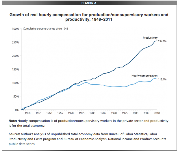
Binyamin Appelbaum, New York Times: Wage stagnation may be our most important economic problem. Wages are supposed to rise with productivity. As workers produce more, it stands to reason that they will be paid more. But as you can see above, wages have lagged productivity since the 1970s.
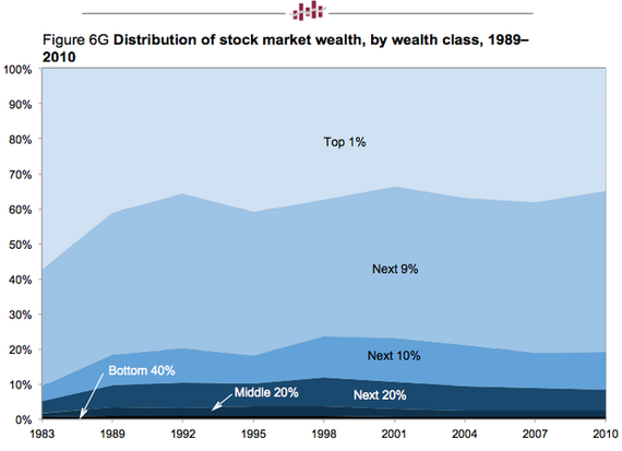
Derek Thompson, The Atlantic: The story of the year was the labor market vs. the stock market. It was a meh year for the former. It was a banner year for the latter. And that made it a banner year for the top 10 percent of the country, which holds about 80 percent of all stock market wealth.
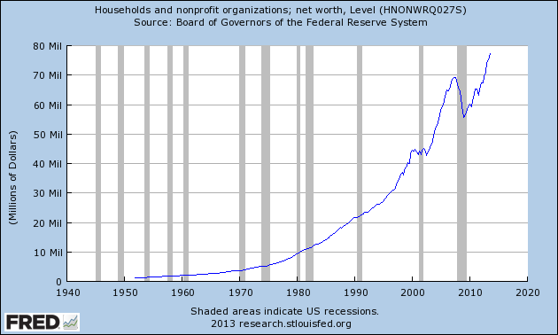
Ben White, Politico: Household net worth surpassed its nominal all-time high this year. It's "probably already taken," White told us via Twitter, "but as far as hope for stronger 2014 this one on household net worth hitting record is my favorite."
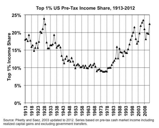
Heather Boushey, economist, Center for Equitable Growth: Emmanuel Saez and Thomas Piketty's data charting the fall and rise of income shares of top earners are well known at this point. The past thirty years have seen the incomes of those at the top explode and the top 1 percent received 95 percent of the income gains from 2009 to 2012. With top earners now receiving as much as that group did during the Roaring Twenties, this chart is a reminder of just how inequitable our income distribution has become.
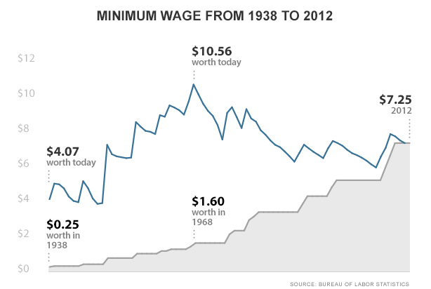
Jordan Weissmann, The Atlantic: You have to admit, there is something a bit crazed about America's minimum wage policy. Every so many moons, Congress battles over whether it's time for a hike. Eventually, Democrats win out. Then we let inflation eat away at its dollar value until liberals decide to pick up the issue again, as they have this year. And so you get the blue line below, the real value of the minimum wage zig-zagging, mostly downward, since 1968. Whether or not we end up raising the minimum wage, wouldn't it make sense to at least index it to the cost of living? After all, if we're going to have a minimum wage at all, shouldn't it remain the minimum?
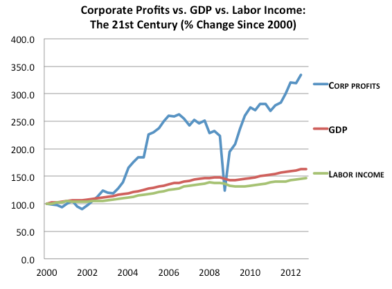
Heidi Moore, The Guardian: Here's why I love this chart: it nails the issue with the inequality at the center of our economy right now. Corporate profits are our only consistently rising metric of economic success. Everything else that matters is bumping along the bottom. Job openings have only modest gains, and nowhere near what we had before the crash. Personal income is stagnant. Unemployment is still absurdly high. That leads to the policy question: is it our goal as a country to fuel only corporate profits? Or do we have some other responsibility to the citizenry?
The Year in (Un-)Employment: A Big Scoop of Meh
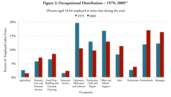
Cardiff Garcia, FT Alphaville: Although the data end in 2009, I found this graph powerfully descriptive given the prominence of inequality as an economic theme this year. The occupations along the bottom run left to right from the least-paid to the highest-paid. What the graph shows is that middle class employment is much smaller as a share of the employed labor force than it was three decades ago.
The top four occupations and three of the bottom four have increased their share of employment at the relative expense of the middle three. Numerous potential reasons have been offered for this change in the employment landscape—the particular nature and pace of recent technological advancement, globalization, the global savings glut and corresponding investment dearth, the incentive structure of corporations, policy deficiencies, or "merely" cyclical causes—but there is no consensus on this hugely important issue.
Jim Tankersley, Washington Post: As I wrote back in November, job insecurities have always been higher among low-income Americans, but they typically rose and fell across all levels of the income ladder. Today, workers at the bottom have drifted away, occupying their own island of insecurity.
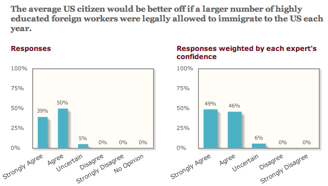
Adam Ozimek, Modeled Behavior: This is a useful reminder that there really is a remarkably strong consensus among economists that high-skilled immigration is beneficial to the average U.S. citizen, and the recent attempts to disprove a skills shortage are really beside the point. Of course a quota induces a shortage relative to what the market demands; what matters is that economists overwhelmingly agree this particular shortage is reducing welfare for the average U.S. citizen.
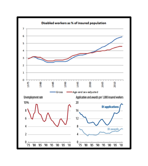
Brad DeLong, Center for Equitable Growth and professor at the University of California-Berkeley: As Jared Bernstein has written, "I've always thought the key test of the claim that lots of people were abusing the DI rolls when they could be working is the extent to which the DI rolls are countercyclical, meaning they go up when the economy goes down. What Kathy finds is applications [do line] up roughly with unemployment. But awards less so [unless you] squint."
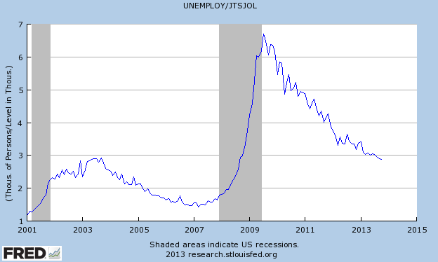
Matt O'Brien, The Atlantic: It's been over four years since the recovery officially began, but there are still just under three unemployed people for every job opening today. That's a big improvement from where we were after Lehmangeddon, but it's still about as bad as things were after the tech crash.
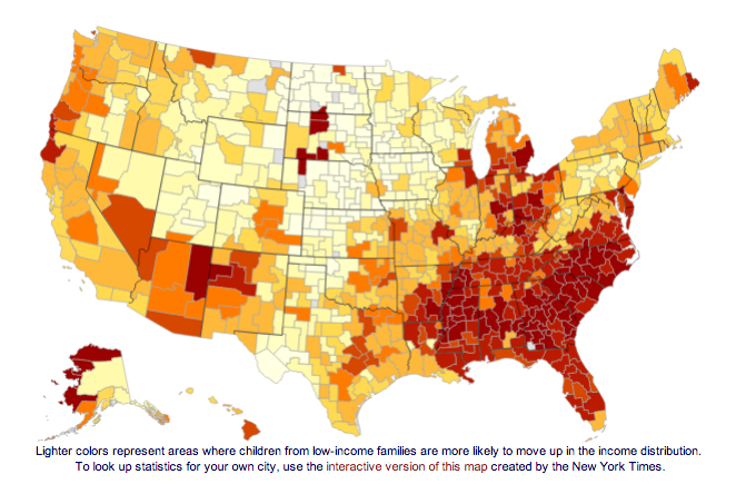
Evan Soltas, Washington Post, Bloomberg View: This map from Raj Chetty's recent work shows which regions have better and worse intergenerational mobility (lighter is better and darker is worse). As I've said before, I know intergenerational inequality is a very uncomfortable subject for Americans. But we need to talk about it more. Only when we recognize that the Dream is largely hollow can we begin to do something about it. Progressive taxation is no substitute for real policies to address it.
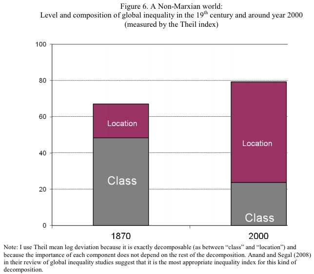
Dylan Matthews, Wonkblog: This is a very simple chart but I think it does a very good job of showing how much nationalistic blinders affect how we think and write about the distribution of income and wealth. Consciously or not, many of us are stuck in a vulgar Marxist mindset where decisions within countries about how much each group gets are of crucial importance. The Occupy movement's "99 percent and the 1 percent" frame gets at this explicitly, but there's a broader tendency, of which I'm as guilty as anyone, to focus obsessively on whether a given policy is "progressive" or "regressive" intra-nationally. But while that really was the most important cleavage in 1870, it just isn't anymore. Talking about a transnational proletariat made sense then; a working class person was a working class person, whether they were in Prussia or France or wherever. But someone in the bottom quintile of China's income distribution does not have much in common with someone in the same position in America.
We need to shift our thinking, in World Bank economic Branko Milanovic's words, "from proletarians to migrants." The key issue going forward isn't how the income will be divvied up within rich countries. It's whether rich countries are going to continue using men with guns to keep would-be migrants impoverished in their home countries
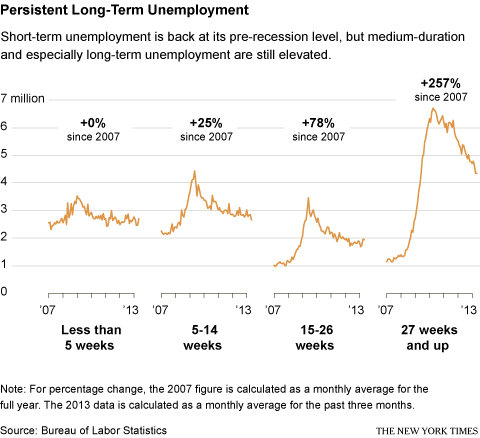
Annie Lowrey, New York Times: This shows that short-term unemployment has returned to its pre-recession levels, but the number of long-term unemployed remains twice as high. I think it's the most powerful depiction I've seen of how the recovery has helped to normalize much of the labor force—but has left the long-term unemployed behind.
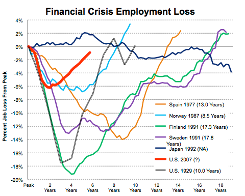
Catherine Rampell, economics reporter, The New York Times: The chart above is an updated version of one that Joshua Lehner, an economist at the Oregon Office of Economic Analysis, posted last year. As you can see, job losses lasted much longer in the aftermath of the financial crises that hit, among others, Finland and Sweden in 1991 and Spain in 1977, as well as the United States during the Great Depression.
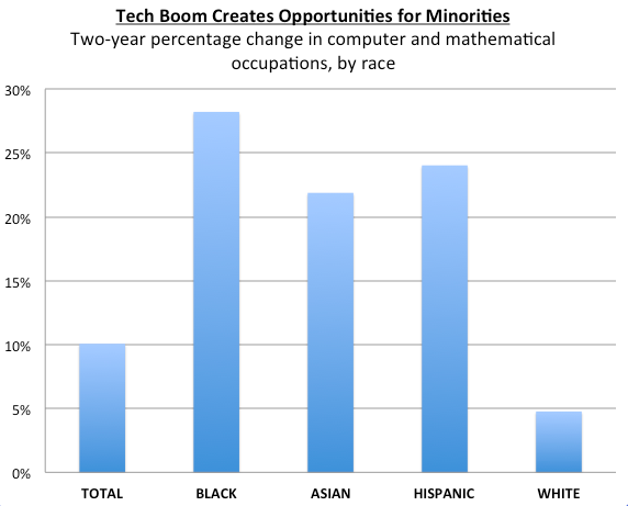
Michael Mandel, Progressive Policy Institute: The tech boom has opened up new opportunities for minorities. Over the past two year, the number of blacks working in computer and mathematical occupations has risen 28%, while the number of Hispanics working in computer and mathematical occupations has risen by 24%. That's more than double the 10% rise in overall tech employment.
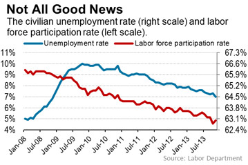
Victoria McGrane, Wall Street Journal: We are in the fifth year of economic recovery since the Great Recession, yet Americans are still fleeing the labor force. That raises questions about just how healthy the labor market really is. The labor force participation rate—Americans who are working or actively looking for work—is 63%, near the lowest level in 35 years. November’s 7% unemployment rate was the lowest in five years, but the drop has been driven in part by the falling participation rate. Among other things, the labor-force-participation puzzle is complicating Fed officials’ efforts to judge the effectiveness of their stimulus programs as they eye the exit from their $85 billion-per-month bond-buying program. Remember when Ben Bernanke predicted in June that the jobless rate would be 7% when QE3 ended?
The Year in Banking: This Time Is Different. Really.
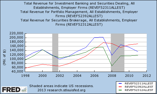
John Carney, CNBC: This chart really shows how the crisis transformed Wall Street. Investment banking and brokerage were brought down to what looks like permanently lower levels. Portfolio management, however, didn't crash as hard and is now the last growth business on Wall Street.
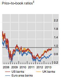
Iza Kaminska, FT Alphaville: This shows banks' price to book ratios, which, despite everything, have not recovered to pre-2008 levels. That chart is from the latest quarterly BIS review. I like it, because it shows "something" is happening in the US and the UK: banks' loan books are about to penetrate beyond the vital 1:1 ratio after a steady run up, meaning loan books are now expected to deliver performance by the market. Tangible equity in banks is being rebuilt. The last time these ratios traded near these levels was in the aftermath of the original QE programs, which had managed to move expectations notably. The question we must ask now, however, is will they continue trade above the 1:1 mark or are they just going to hover at 1:1 for the significant future. This is important because it has consequences for the distribution and fungibility of bank money as well as banks' ability to raise capital cheaply and to retain it.
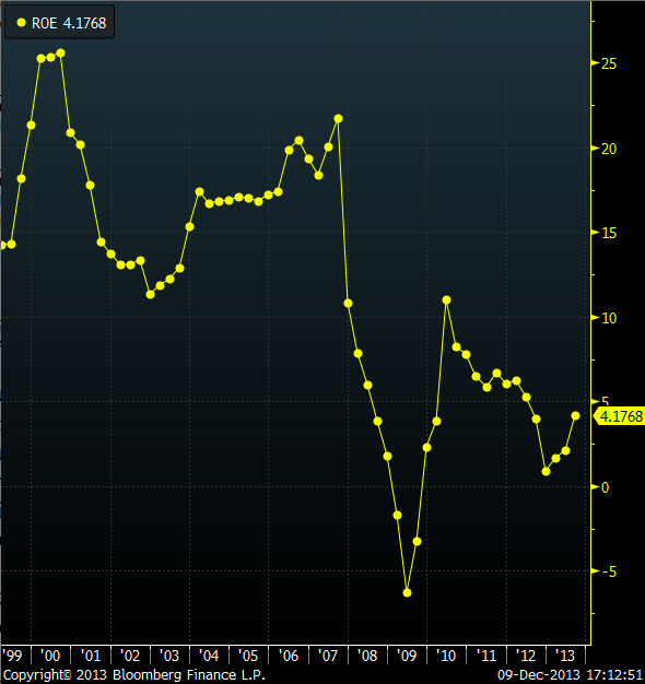
Matt Zeitlin, Buzzfeed: This shows investment banks' return on equity. Now, complain all you want about the shortcomings of Dodd-Frank and Basel III, but one thing is clear: Investment banks haven't gotten close to generating the returns that their investors demanded before the crisis. While some banks are well above the 4% average return on equity (Goldman Sachs is at 10%), the industry really has gotten less profitable (driving down the numerator) and better capitalized (boosting the denominator). And if banks really can't generate that much on the capital they get from their investors and their earnings, they might even get smaller. Too bad for the bankers, though.
The Year in Investing: Bulls and Tapirs
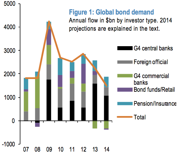
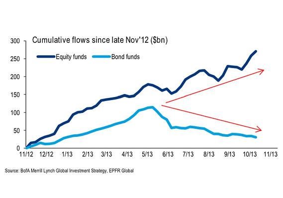
Felix Salmon, Reuters: This chart suffices to explain why the markets care so much about the taper: central-bank buying accounts for $1.6 trillion—more than half—of the total demand for bonds in 2013. Meanwhile, private banks are taking the opposite side of the trade: while they were huge buyers of bonds in 2007 and 2008, they’re net sellers in 2013 and 2014, more or less completely negating the buying pressure from pension funds, insurance companies, bond funds, and retail investors. In 2014, it seems, substantially all the net demand for bonds is going to come from the official sector. So it matters a great deal when that demand is diminished.
What’s more, central-bank buying, overwhelmingly from the Fed and the Bank of Japan, accounts for the lion’s share of official-sector buying: Sovereign wealth funds and other foreign official institutions will buy just $364 billion of bonds this year, according to JP Morgan’s estimates, down from $678 billion last year. So the heavy lifting is very much going to be conducted by QE operations.
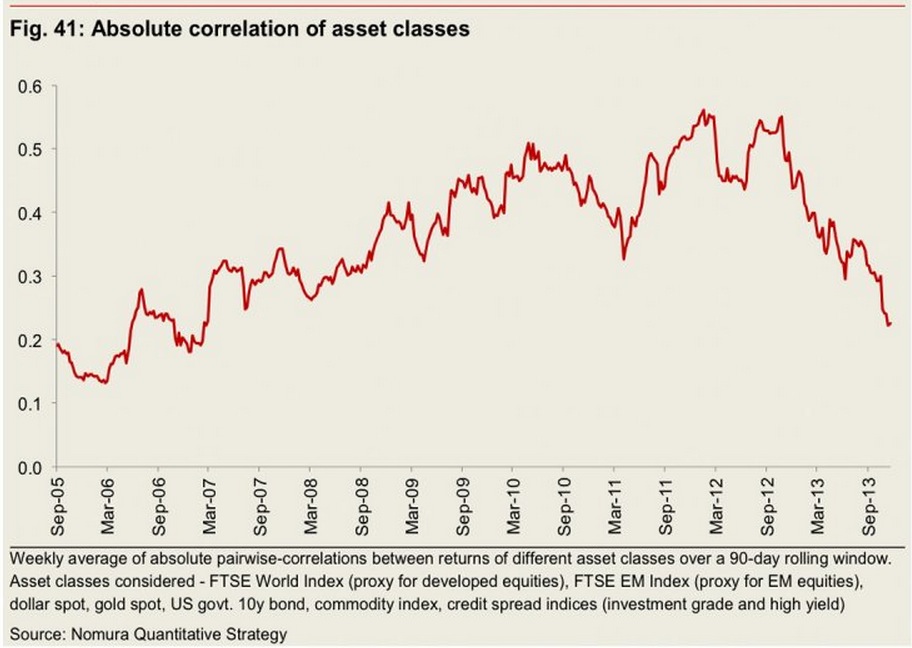
Joe Weisenthal, Business Insider: 2013 will do down as the year the financial crisis really came to an end. For the first time since 2008 there were very few moments when it felt as though things could unravel again. In markets, one of the characteristics of a crisis is extreme correlation between multiple asset classes: everything trades up or down together. Fund managers have lamented the "Risk On/Risk Off" environment that's dominated markets since 2008. With the crisis coming to an end in 2013, so too have these extreme correlations. This chart from Nomura measures the extent to which various asset classes move together. As you can see, in 2013, these correlations saw a dramatic fall.
Joshua Brown, The Reformed Broker: This is the one that I think best illustrates what 2013 was about for investors—the sudden realization that they weren't being fooled, that stocks were for real and the return to normalcy was a playable theme.
Corporate earnings grew by 6 percent or so this yea, but the multiple we were willing to pay on those earnings grew by almost 20%. Huge news and the best sign that America is regaining confidence in the institution of investing again.
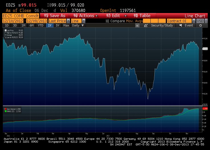
Matthew Klein, Bloomberg View: This shows the price of December 2015 euro-dollar future contracts over the past 12 months. What you can see is the tremendous increase in implied future short rates from May-September followed by a remarkable return to March/April levels since the no taper decision. One interpretation is that, after a rough few months, the Fed has successfully convinced traders that its intentions over LSAPs are disconnected from its plans for short rates.
This interpretation is supported by the fact that the 10-year yield is not demonstrably lower than its peak in early September. (One could therefore ask what if anything the Fed accomplish for the real economy by delaying tapering but that's outside the subject of this chart...)
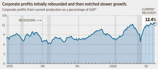
Sudeep Reddy, Wall Street Journal: The past year showed us more than ever the striking disconnect between financial markets and the economic environment most Americans are facing. Corporate profits as a share of the economy are at a post-World War II high, and companies are sitting on piles of cash, yet firms are more cautious than they've been during any stretch of recent history. Why consumers and businesses have been so unsettled for so long will be studied for decades.
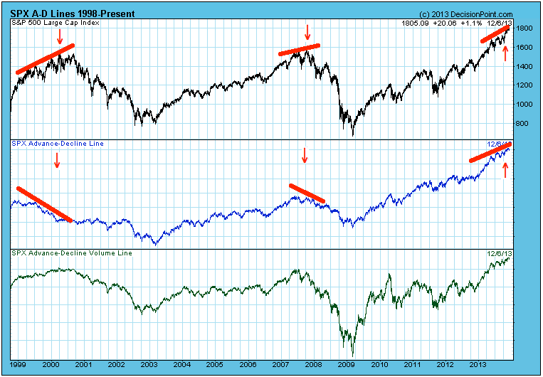
Barry Ritholtz, Bloomberg View: One of the best ways to identify a market that is exhausted is to look for any divergences between Breadth (i.e, the Advancers vs Decliners) and Price (ie., New Highs). Market breadth remains good—we do not see any major divergence between A/D and equity prices. That strongly suggest that this current rally is not over.
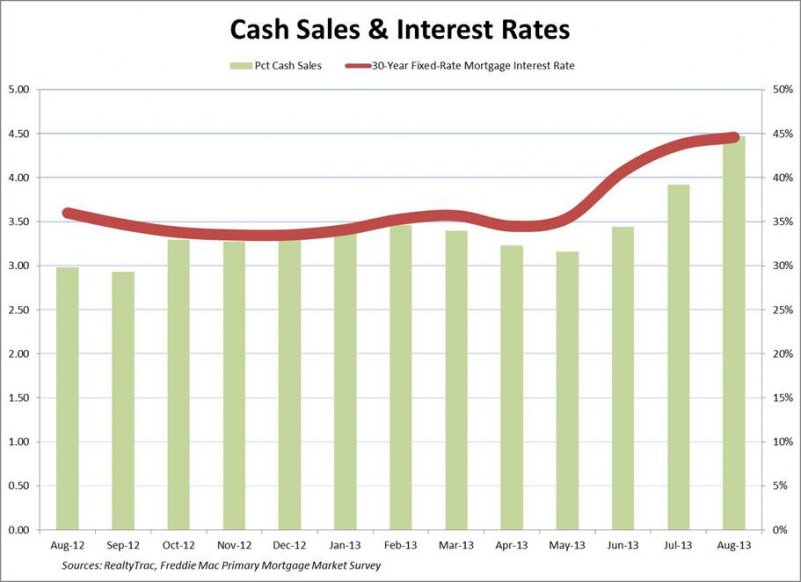
David Dayen, Salon: What has been generally recognized as a housing recovery has much to do with a spike in all-cash sales, as this chart shows. That comes from two sources: wealthy foreigners picking up homes in America, and institutional investors scooping up properties in communities hard-hit by the housing bubble, with the plan to turn them around for rent (with predictable slumlord-like consequences). As you see here, when mortgage rates rose with the threat of the taper in the summer, the share of all-cash sales rose as well, as financing became less affordable. This chart shows how inequality has manifested itself in housing - potential first-time homebuyers, increasingly debt-burdened and job-insecure, have delayed big purchases, leaving the market to those with cash. The chart also raises questions about the durability of a housing recovery based increasingly on rich people and bargain-hunting investors.
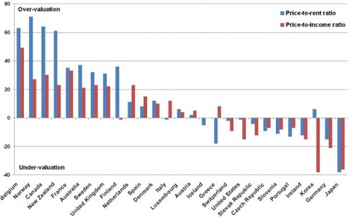
Edward Harrison, Credit Writedowns: This is the one I like, since people are starting to talk about housing bubbles again. Notice where America is—still undervalued.
The Year in Debt: Talking Points & Tipping Points
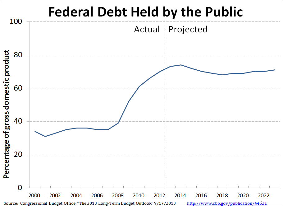
Justin Wolfers, New York Times, professor at the University of Michigan: Let's talk about our fiscal situation—and this chart is a clear reminder that it's time to update those tired old talking points. Rather than bemoaning rising public debt, realize that in fact, as a share of GDP it's stabilizing, and is set to be stable over the next decade. Surprised? Don't be. Remember the 2011 continuing resolution, the debt ceiling deal called the Budget Control Act, the "fiscal cliff" deal, and the sequester? They've all cut the deficit. And the ongoing economic recovery is a particularly powerful force in cutting spending. The result? The budget deficit has declined dramatically, from 10% of GDP in the wake of the Great Recession, to less than 4% last year, and it'll fall to a couple of percent of GDP in the next couple of years.
This isn't to deny that we have important fiscal issues. In the short run, it's critical that Washington does something to spur the recovery that it has leaned so heavily against over recent years. And my chart omits the more worrying (and also more uncertain!) longer-run projections, which suggest that demographics and trends in medical spending could raise the debt. But over the next decade, the non-partisan Congressional Budget Office is effectively saying, "she'll be right, mate." Don't believe me? Check out their latest numbers.
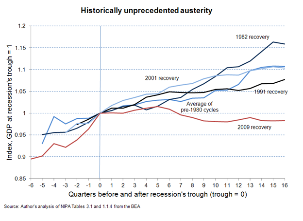
Josh Bivens, Researcher and Policy Director at the Economic Policy Institute: At this point, the agonizingly slow recovery from the official end of the Great Recession can be almost entirely explained by austerity in the public sector. The chart below shows growth in real public spending (state, local, and federal, and including transfer payments like unemployment insurance and Social Security, as well as direct spending like hiring teachers to staff public schools) following the trough of recessions since 1954.
At this point in the recovery, public spending following recovery from the Great Recession is by far the weakest on record. Particularly instructive is comparing the past 4 years with the 4 years following the recession that ended in 1982. That early 1980’s recession was extraordinarily steep – unemployment rose to a higher peak than during the Great Recession. Yet 4 years following its end all economic slack it caused was gone, whereas today’s economy is far from fully recovered. Yet if public spending following the Great Recession had mirrored its trajectory following the recession ending in 1982, the U.S. economy would essentially be back to pre-Great Recession health.
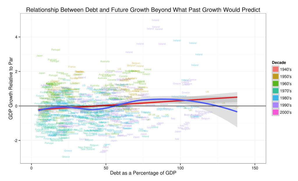
Miles Kimball, Supply-Side Liberal, professor at the University of Michigan: Because of the controversy over Carmen Reinhart and Ken Rogoff's suggestion that high debt would lead to lower growth, Yichuan Wang and I decided to look at the Reinhart and Rogoff data for themselves. This chart (which first appeared here) encapsulates their bottom line: they found no evidence for a negative effect of national debt on economic growth in the Reinhart and Rogoff data once they took into account the routine predictive power of past growth for future growth.
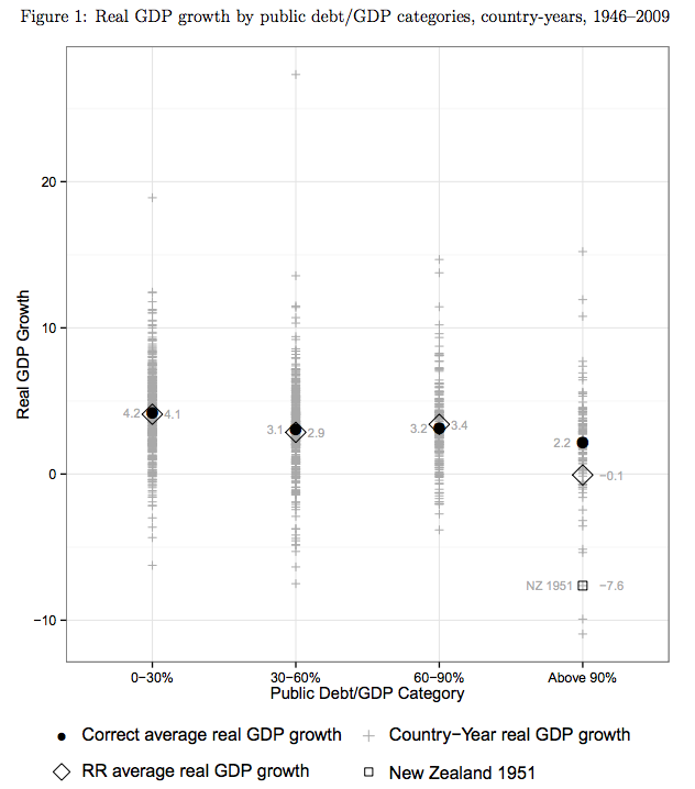
Kevin Roose, New York magazine: Hands down, the best economic story of 2013 was the David-and-Goliath tale of the 28-year-old UMass Amherst grad student, Thomas Herndon, who debunked a famous study by two Harvard professors Carmen Reinhart and Ken Rogoff. Herndon's paper showed that Reinhart and Rogoff had made a basic math mistake and therefore wrongly claimed that a country's growth fell off sharply once its debt-to-GDP load reached 90 percent—a claim that was borrowed by conservatives all over the world to argue for government spending cuts. The paper, and its implications for the political debate about debt, made Herndon an instant celebrity (he appeared on the friggin' Colbert Report!), was the talk of economists for months, and had a real impact on the discussion about global austerity. It was the Excel error heard 'round the world.
John Sides, The Monkey Cage: This graph charts the trend in what's called "public mood" -- the public's overall liberalism or conservatism, derived from hundreds of different survey questions. (Lower scores mean more liberal, and higher scores mean more conservative). The questions concern many different topics, but they all boil down to one basic thing: whether the public wants the government to do more or less in terms of spending, regulation, and the like. The graph shows that public opinion tends to move in the opposite direction as the party that holds the White House—in a liberal direction under Republican presidents, and in a conservative direction under Democratic presidents. Under Obama, public opinion has taken a very sharp conservative turn, leaving the public more conservative than it has been in decades.
Why does this chart belong in a list of "economic" charts? Because it illustrates the constraints facing economic policymakers right now, particularly the president. Even though certain kinds of government activism under Obama may have helped the economy—such as the stimulus and the extension of unemployment benefits—this shift in public opinion makes it harder for the government to do more to address the economic problems that remain.
The Year in Health Care: Slow and Steady...
Adrianna McIntyre, The Incidental Economist: With or without website glitches, we would have expected early enrollment at HealthCare.gov to skew disproportionately older and sicker. This is evident from trends in Massachusetts, where enrollment of young and healthy individuals spiked just as the mandate kicked in. The last day to sign up for health insurance in the exchanges before the mandate kicks in is March 31, 2014.
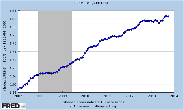
Eddy Elfenbein, Crossing Wall Street: Here's the Medicals Costs portion of the CPI divided by the Core CPI. This trend has been rising for decades, but it's slowed down recently. It's still too early to call is a trend. But obviously, if healthcare inflation soon becomes like regular inflation, then it's a game changer.
The Year in Inflation: Growth and Expectations
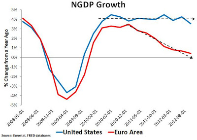
Scott Sumner, Money Illusion blogger and professor at Bentley University: The US and the Eurozone did roughly equal amounts of austerity. But the US had some unconventional monetary stimulus whereas the eurozone raised rates several times in 2011 to slow inflation. You can see the results of this natural experiment.
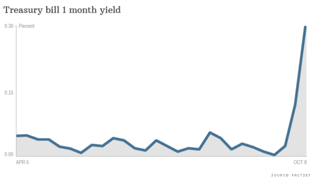
Noah Smith, The Atlantic, Noahpinion, & professor at Stony Brook: No one is still quite sure why the Republican party shut down the government, or decided to play chicken once again with the debt ceiling. But this much is certain: The world believed the GOP was serious. Spiking Treasury yields on October 7th and 8th mean that the investing public thought there was a real chance that the Republicans would force the U.S. into a technical sovereign default. For the first time in living memory, U.S. debt carried a substantial risk premium. And here's the really scary thing: If the GOP did this kind of thing in 2011 and again in 2013, what's to stop them from doing it again, and again, and again?
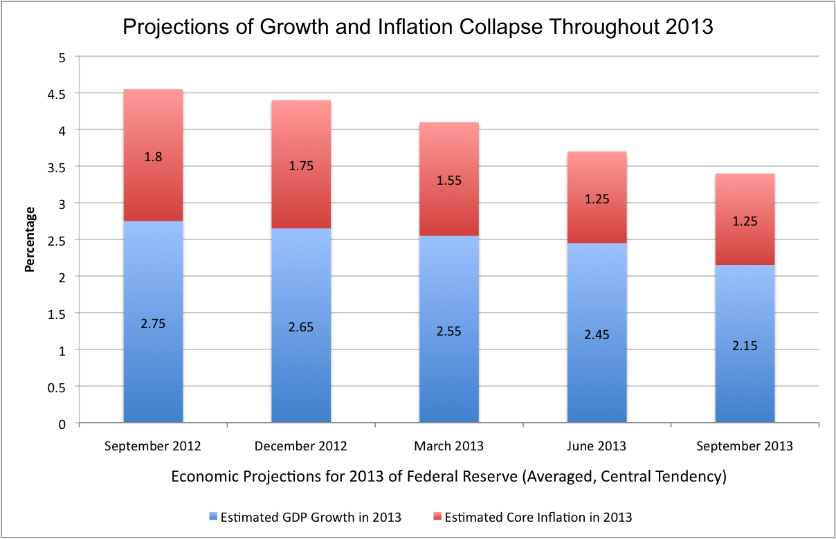
Mike Konczal, Roosevelt Institute: Throughout 2013 projections and estimates for growth were written down. Though a series of slow writedowns in response to a series of unnecessary austerity imposed too quickly, viewed together it shows a wasted year in terms of getting us back to full employment. As the sequestration became clearer, any potential upside from a recovering housing market was more than netted out by the self-inflicted rule.
Most disturbing was the collapse in inflation after the overhaul of policy introduced by the Federal Reserve in late 2012 to hit its inflation target. Instead of a period of above average inflation, which many had expected and hoped for in response to the very rapid adoption of the Evans Rule as Federal Reserve policy, we have record low inflation. All in all, a year that could have been, and should have been, done differently.
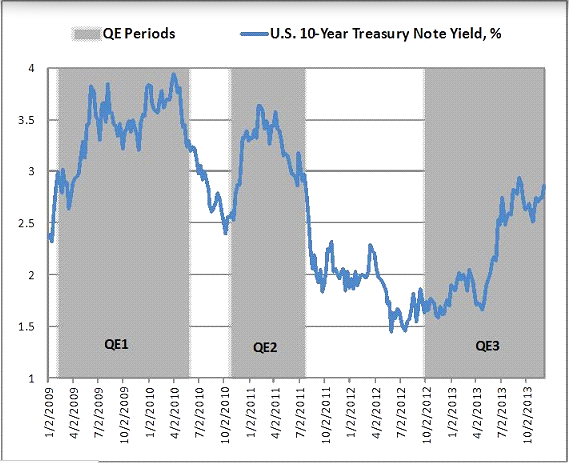
David Beckworth, Macro and Other Market Musings, Professor at Western Kentucky University: Despite the stated intentions of the Federal Reserve, the QE programs have coincided with rising treasury yields. QE2 and QE3 have also coincided with growth in privately-produced safe assets. Some have attributed the rising yields under QE3 to the Fed’s taper talk. But real yields started rising before the taper talk and were going up in other countries too. If anything, the taper talk was the Fed acknowledging the improving fundamentals that were driving up yields during that time. Though modest, these developments attest to the Fed’s potential to spur economic growth through large scale asset purchases if done properly.
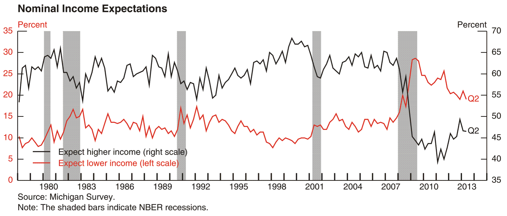
Claudia Sahm, Senior Economist at the Federal Reserve: Households views about their income prospects, for example, as measured in the Michigan Survey of Consumers, worsened sharply in the recession and remain depressed. While income expectations have gradually improved over the past two years, the remaining pessimism among households may be a phenomenon that continues to weigh against a recovery in consumer spending.
The Year in Energy: A Revolution
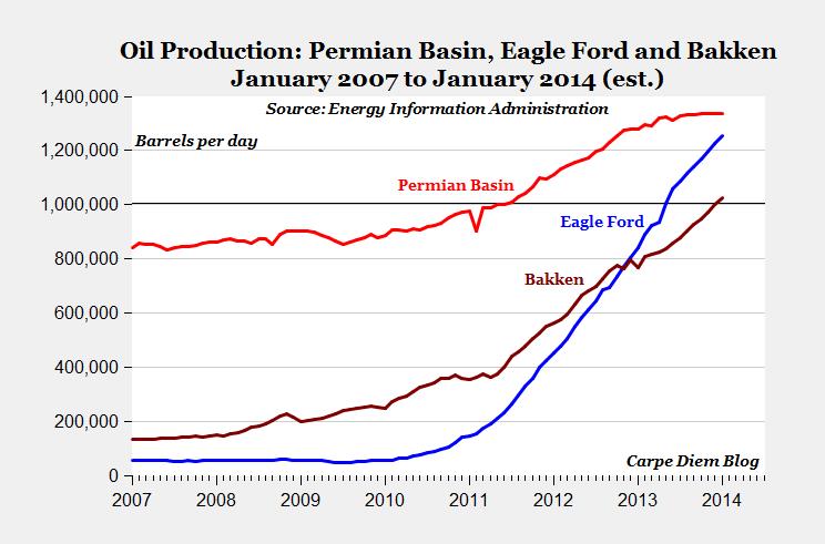
Mark Perry, Carpe Diem blog, AEI scholar, professor at the University of Michigan-Flint: This chart illustrates the significance of The Great American Energy Boom. It shows oil production in the nation’s three largest oil fields over the last 7 years, and the meteoric rise in two of them over the last several years. In 2013, two of those oil fields—the Eagle Ford Shale in Texas and the Bakken formation in North Dakota—hit a major oil production milestone of crude oil output exceeding one million barrels per day (bpd). According to estimates from the Energy Information Administration (EIA), oil production in the Eagle Ford Shale surpassed one million bpd in May and the EIA projects production in the Bakken formation will exceed one million bpd this month (December).
Those two oil fields will join a third US super-giant oil field—the Permian Basin in Texas, which surpassed one million bpd back in 2011—and become part of an elite group of only ten oil fields globally to ever produce at the one million bpd level. “Saudi America’s” three super-giant oil fields are making a major contribution towards America’s record-setting increase in crude oil output this year, which is on track to be the largest annual increase in oil production since the beginning of U.S. commercial crude oil production in 1859.
The Year in Chinese Pollution: A Killer
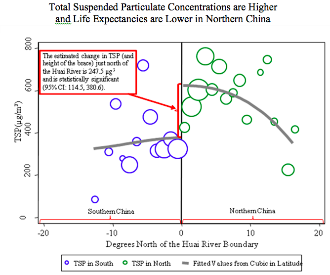
Michael Greenstone, 3M Professor of Environmental Economics, MIT: The Chinese government has provided highly subsidized coal for heating north of the Huai River, which delineates North and South China, since the 1950s. The policy dramatically increased total suspended particulate (TSP) air pollution in the north of China (see above, where the circles are proportional to population at each degree latitude north and south of the Huai River boundary). The higher air pollution concentrations increased the cardiorespiratory (e.g., strokes, lung cancers, and heart attacks) mortality rates, reducing life expectancies in the North by 5.5 years, relative to the South. Ultimately, this policy is causing the 500 million residents of Northern China to lose more than 2.5 billion years in life expectancy. [Source: Y. Chen, A. Ebenstein, M. Greenstone, H. Li, Evidence on the impact of sustained exposure to air pollution on life expectancy from China’s Huai River policy. Proceedings of the National Academy of Sciences. 110, 12936-12941 (2013).]