How New Fonts Are Helping Dyslexics Read and Making Roads Safer
The right font can be appealing, but please don’t take this as an excuse to use Comic Sans
/https://tf-cmsv2-smithsonianmag-media.s3.amazonaws.com/accounts/headshot/Jimmy-Stamp-240.jpg)
/https://tf-cmsv2-smithsonianmag-media.s3.amazonaws.com/filer/Design-Decoded-New-Fonts-Dyslexics.jpg)
We all have the wacky family member or coworker who insist on decorating their emails with a variety of fonts and colors. And woe to the poor soul who sends a graphic designer an email written in comic sans. But choosing a font is more than just a matter of decoration and taste. A well designed typeface, like a well designed…well, anything, can make a brand iconic, can benefit the public good, and it can even improve lives.
An example of a typeface with such potential is Dyslexie, from studiostudio graphic design. It’s estimated that about 15 percent of the world population have some form of dyslexia. For these people letters and characters can appear flipped, rotated, and transposed. As a result, they have trouble decoding the system of lines, curves and dots that we perceive as written language. As its name implies, Dyslexie was designed make reading easier for people with dyslexia. And to look good doing it.
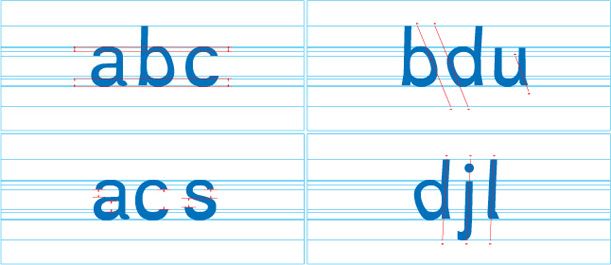
Among its distinguishing features, the lower portion of letter has a heavy baseline thickness, weighting it down to help prevent it from flipping. Additionally, larger openings and spaces in letters make them more distinguishable from one another, as does the use of a very subtle italic on some characters. Characters that can appear identical when flipped, such as the lowercase b and d, have different elliptical curves with distinct slopes.
The preliminary research that produced the typeface (pdf) included a relatively small survey of 43 people, single-word tests, and one control font: Arial. While Dyslexie didn’t prove to increase reading speed compared to Arial, the test group did make fewer reading errors, and the designer suggests that the study could be expanded in the future to test speed and comprehension to further refine the typeface.
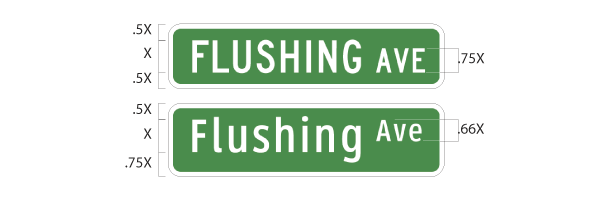
Clearview is another typeface designed to make a difference. Last year, New York City spent $27.5 million to replace 200,000 street signs with new, easier to read, mixed-case versions printed in Clearview, which was created way back in the 1990s specifically to be used for transit signage.
Also last year, researchers at the MIT AgeLab, working in conjunction with type and technology company Monotype published a paper (pdf) arguing that automotive GPS navigation systems could be redesigned to reduce the time that drivers take their eyes off the road. Their research showed that a certain style of typeface could reduce the time drivers look down at their dash by 10 percent. Those quick glances add up.
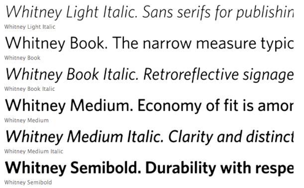
More recently, The Whitney Museum of American Art unveiled a new graphic identity that “embraces the inventive spirit of the Museum, and signals other changes afoot” as the museum prepares to move to its new Renzo Piano-designed building in 2015. A major component of this rebranding, which was masterminded by designers Experimental Jetset, is a new typeface, Neue Haas Grotesk. The last time Whitney moved into a new building, Marcel Breuer’s masterpiece on Madison Ave. (1966), they also adapted a new typeface – a bespoke design by Hoefler & Frere-Jones. Aptly named Whitney, it ensured consistency among their publications, promotional materials, and public signage. Crafted in 52 styles, it was incredibly diverse and worked well for long form reading in print catalogs, larger wall graphics and way-finding signs, explanatory text, and even translates well to computer screens.
That pulldown list of strange and exciting fonts in today’s word processing programs is a constant temptation and expressing individuality is important, but if you happen to be that wacky family member or coworker, why not take a second to think about improving the lives of those people you’re cc’ing.
/https://tf-cmsv2-smithsonianmag-media.s3.amazonaws.com/accounts/headshot/Jimmy-Stamp-240.jpg)