Finally in English: The World's Best Type Reference Guide
Joep Pohlen's Letter Fountain, a handbook that stands out in design publishing's most crowded category, has hit American shelves
Joep Pohlen's Letter Fountain, a handbook that stands out in design publishing's most crowded category, has hit American shelves
More type reference books are published each year than any other books about graphic design. So, I wonder, is there anything left to be said about this most quotidian of communications? Even if you believe that all the collected knowledge about type and typography has been somehow hashed and rehashed, there will always be someone who will say it fresher or with greater insight than the last expert. And since type is such a critical subject for designers, almost everyone has something to say—even if it has been said before.
I am sure, for instance, that I already read much of the information before in Letter Fountain: The Anatomy of Type by Joep Pohlen in different volumes and venues, but honestly it doesn't matter. Every few years a new "handbook" presents a distinct practical or historical viewpoint. This is the latest and, for my money, the most comprehensive of these guides so far. Moreover, it fits well on my desk, making it a handy reference too.
I contacted Pohlen, proprietor of Polka Design in the Netherlands and author of Fresh Fonts (about fonts made in the '90s), to discuss his motivation for authoring Letter Fountain at this time, and to talk about the key differences between his and other books on type.
Letter Fountain (or Letterfontein, as the non-English versions are called) was initially self-published in 1994 in French, German, and Dutch. 15,000 copies were sold by 2000, over half of them in the Netherlands, at which time the book went out of print. Apparently, Pohlen says, teachers in the Netherlands were so dependent on the book for their type classes they told students to buy second-hand copies. With that impetus, Pohlen decided to revise and enlarge the book from 15,000 to 150,000 words. In 2009, after seven weeks of brisk sales, the first printing sold out. In 2010 the next edition was published internationally by Taschen Books and is currently available.
Yet with so many books on type and typography on the market, why this one—and where does it stand against the competition?
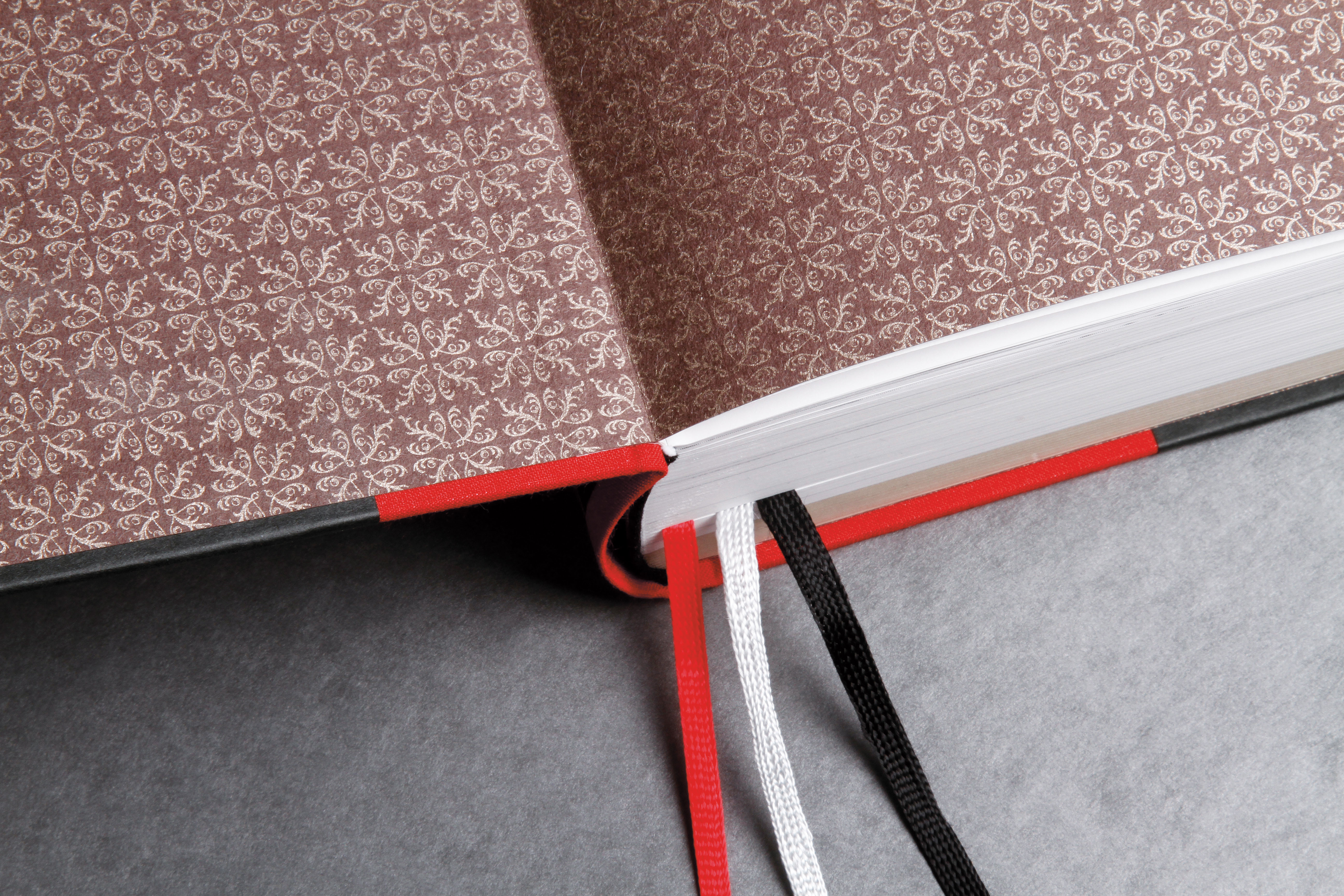
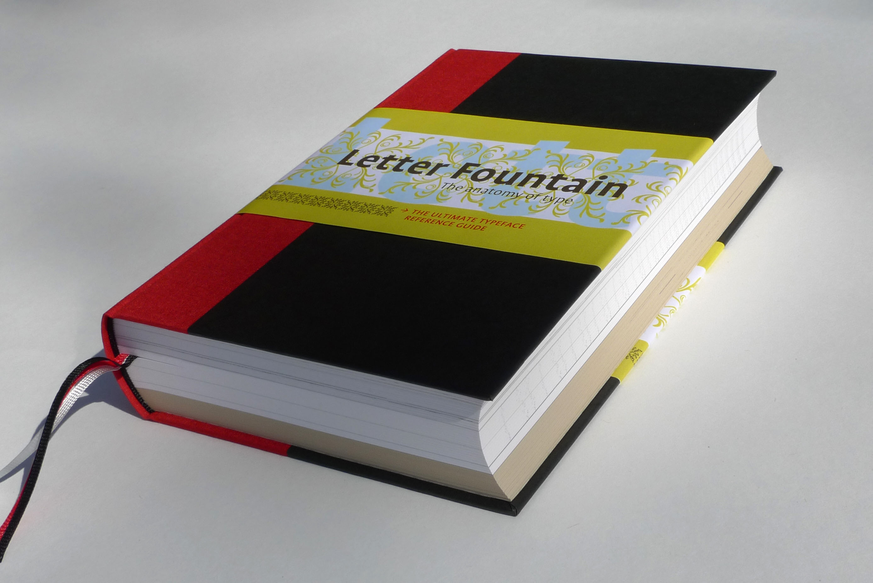
Classic endpapers and three ribbon bookmarks complete this handbook.
Typeforms from Trajan's Column (top left page) in Rome are the beginning of Western type design. Letter Fountain spans almost 2,000 years of type design.
"I have not made the book to compete with English handbooks," Pohlen explains. "I wanted to make our [original] handbook better. Because we always stand on the shoulders of the people who had written before about typography I already had a collection of type books in different languages, from Hermann Schmidt Verlag in Germany, Niggli in Switzerland, and of course some others like the beautiful books The Elements of Typographic Style by Robert Bringhurst, Letters of Credit by Walter Tracy, Designing Type by Karen Cheng, and so on." (Pohlen highlights in red some favorite books in his bibliography.)
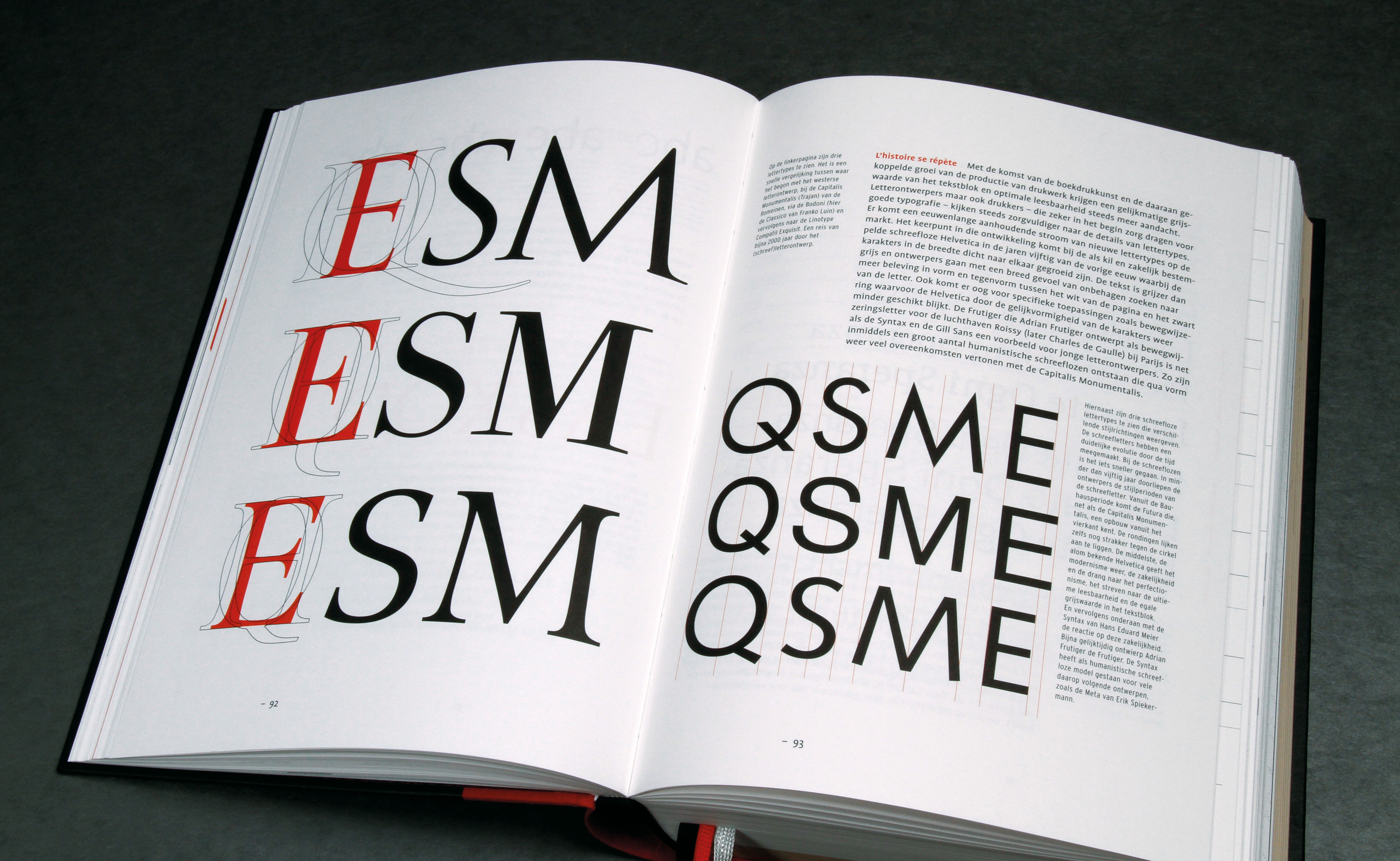
"I don't think my book is better than the other books; it's different," he says modestly. "Its a book where readers can find a lot of information about most of the things they have to know about type, from PostScript to grids to type for the visually impaired to V-shaped letter." Letter Fountain also provides teachers with several useful tools, including scores of type specimens and the timeline "typography and art" (on pages 30 to 36), which Pohlen claims is one of the most copied parts of the book by students. "Teachers also love the comparison between three serifed types and three sans-serifs because," he adds, "they let students draw by hand the characters to let them feel the difference between for instance a Helvetica and a Univers."
Most mainstream typography books show examples of work from famous designers. From the outset Pohlen did not want that. "Students have to learn to design for themselves and not learn to copy from other peoples' design," he insists. "This is not a how-to-do book in that sense. I wanted to give the reader as objective as I could the language he or she needs to develop their own style." In fact, Pohlen does not offer the requisite dos and don'ts. "I give information how it is normally done." But he also allows other voices to be heard, like the designer on page 182, who says: "I invented the system, so I can fuck the system." Pohlen adds, "That is the moment that new design is made and I would be happy if I can contribute with my book to reach that moment."
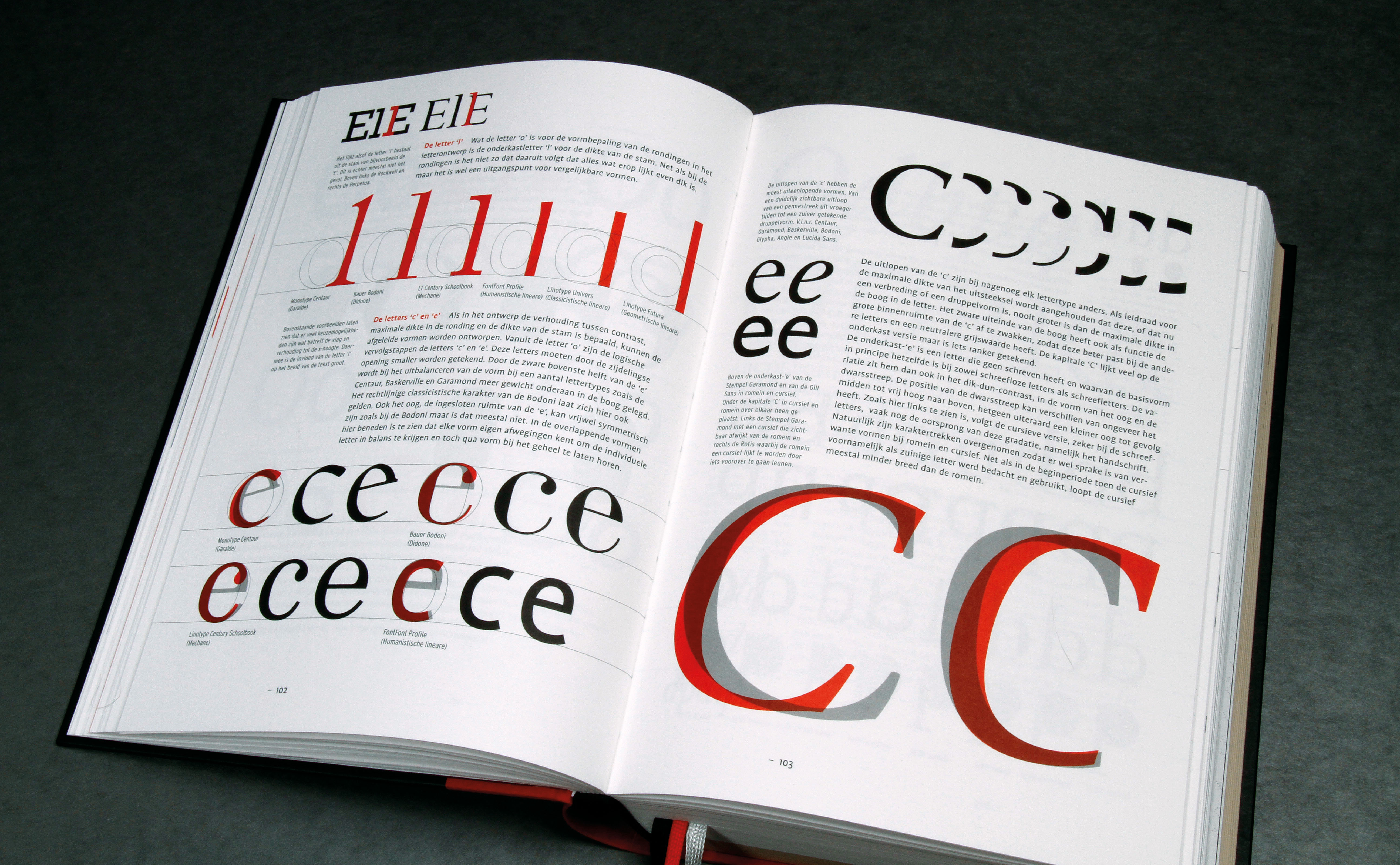
Every letter of the alphabet is discussed in the chapter "The anatomy of the letter." Design principles are shown as well as a comparison between capitals and lowercase and the differences between roman and italic.

Some of the most famous type designs are those from the Frenchman Claude Garamond. The book shows more than 150 typefaces extensively in both examples and alternatives to make choosing a typeface easier.
Letter Fountain aims to make readers aware that typography is nourished by history. "Innovation has to come from knowledge," he asserts. And one of the most significant assets of Letter Fountain is the unique timeline of type publishers at the end of the index of type companies. "While making the index all the dates were tumbling around in my head and even I thought it was difficult to remember when certain events took place in time," Pohlen notes, adding, "the huge part of the book that contains the indices, bibliography, glossary, and so on is also a very important part of the book. When you want to find quickly the fonts of a designer or a specific font, you can find it. When you want to know more about a word you see in the book, you can look it up in the glossary. I think that with this part of the book I made it possible to search through the book like you do on the Internet."
Speaking of the Internet, is having such a brick of a book really the way to appeal to the Web generation? "Some people will read the book entirely but I don't have the illusion that most people will do that. I think most of them will pick up the book and read parts of it like they do on the Internet. Search and find."
Pohlen is also preparing an educational site based on the book in Dutch, French, German, and English. The first Dutch version is at www.letterfontein.nl. Another site is www.crucialfuel.com, where Pohlen shows some of the type specimens he bought for Letter Fountain.
Images: Joep Pohlen