The Real Helvetica: A Designer Restores the Original Font
Helvetica wasn't always the cold, rational typeface it is today. For the first time, someone is bringing back its beauty.
In which camp are you? Those who cannot get enough Helvetica, the world's most famous sans serif font, or those who have had more than enough. One cannot be neutral about this neutral typeface. Christian Schwartz, a partner in the type foundry Commercial Type, is steadfastly an Helveticaphile and on June 7 his restoration of the original Helvetica, "Neue Haas Grotesque," will be released by Monotype Imaging.
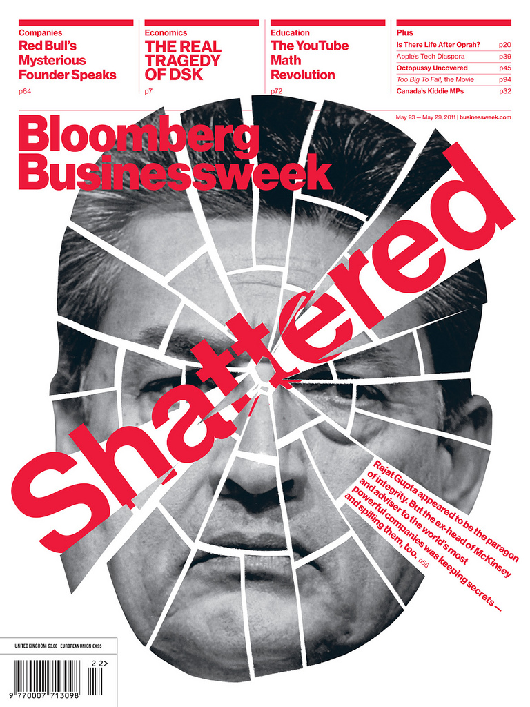
Originally made for The Guardian in London, as part of its 2005 redesign, it was rejected but found new life in the redesign of Bloomberg Businessweek last year. So why is this Helvetica different from any other?
"The biggest difference," Schwartz explains, "is that I made separate versions for text and display, which allowed each to do what they need to do in order to work best at their respective sizes without becoming clogged and spotty in texture at text sizes, or overly loose at larger sizes." For the non-type person who may be reading this, this is not the equivalent of angels on the head of a pin. These are essential design issues. Neue Haas Grotesk, the original name for Helvetica, was initially produced for typesetting by hand in a range of sizes from 5 to 72 points, but Schwartz notes, "the digital Helvetica has always been one-size-fits-all, which leads to unfortunate compromises."
In addition to having much looser spacing, Schwartz says, "Neue Haas Grotesk text has a significantly different weight range from the headline version, as a proper Regular for display looks too light as text. But a proper Medium has the opposite problem. It also includes subtle improvements for text sizes, like ink traps, which keep M or W from clogging in text but look awkward and strange in a headline."
Anyone who knows Helvetica is aware that it is meant to have no quirks or eccentricities. So what is the benefit of this version compared to others? "The curves are smoother, for one thing," Schwartz says. "Most importantly the spacing is tighter in the Display size. From what I can tell from his notes, Eduard Hoffmann, the art director at the Haas Typefoundry, who in 1957 developed the face with Max Miedinger, considered very tight spacing to be the key to this face. In those days tight spacing was a relatively new idea."
Since Helvetica has never completely fallen out of favor, Schwartz's version is more restoration than revival. "Helvetica has existed in digital form since digital typesetting was invented," he says, "but nobody has ever gone back to the original typeface as it existed as handset metal type and tried to recreate that." What's more, the original design of Neue Haas Grotesk for handset metal has been compromised several times since it was first renamed Helvetica.
Schwartz lists a litany of Helvetica sins. Early on, regular and Bold weights were altered, changing the relationship between the two weights because of technical limitations related to printing. Furthermore, when the family was adapted for the more advanced process of phototypesetting, "the compromises that had been made were kept as they were, rather than going back to the original, no doubt to keep type set with the two different technologies as consistent as possible." Then, in the 1980s, the Linotype Design Studio redrew the family, which had grown into a huge set of disparate weights and widths, as Neue Helvetica. "The Condensed and Extended demanded squarer curves and bowls, so the normal width got them as well, making the whole set into one extensive, consistent workhorse but sacrificing some of the personality of the original," Schwartz says. "My digital version of Neue Haas Grotesk is an attempt to bring this back to life as authentically as possible."
Helvetica's detractors rail that it is boring, but after spending time working on Neue Haas Grotesk, Schwartz argues that Helvetica "was never intended to be the cold, perfect, rational typeface people believe it is. There is a subtle warmth in the shapes that was lost over the years. When designers use existing digital versions of Helvetica, they are using a compromised version of Miedinger's original drawings and Hoffmann's original ideas, and while I don't think the original should replace what has come after it, I think it's nice to have the choice."
Schwartz is cognizant that the face is often misused, and sees more disciplined applications at Bloomberg Businessweek. "In a lecture on the Bloomberg Businessweek redesign last month, [design director] Richard Turley said that in effect, using Neue Haas Grotesk made him and his staff have to work a little bit harder and make sure their ideas were solid, particularly for feature spreads, because the type does a great job of communicating an idea when you have one, but isn't interesting enough on its own to make up for the lack of one."
Over the years Helvetica has, arguably, become a faceless face. So how does Schwartz see its role today? "Year after year, vanilla is the most popular flavor of ice cream in the U.S. I think of Helvetica as a perfect vanilla."
Image: Bloomberg Businessweek