You may not realize it, but you are in a war. You are in a war for attention, against millions of other business owners, bloggers, and organizations. Your best weapon? A solid brand that makes your audience stop scrolling, take notice and remember you.
Styling your website is a part of building an attractive and trustworthy visual brand. However, too many people make these 3 dire branding and design mistakes on their sites. Keep reading for tips on how to avoid them, including reviews of CSS Hero features that help you create a stand-out style for your WordPress website.
Design mistake #1: Inconsistency
If today you’re using cartoon characters and bright colors in your branding and tomorrow you switch to high-end stock photography in muted colors – even your most devoted customers will not recognize your brand.
While an occasional rebranding is, of course, OK, constant jumping between visual styles leads to decreased recognition of your brand. That means decreased return on the investment of time and money in your marketing.
The same principle applies to your site: Design and branding consistency plays a huge role, even if your site is five pages long.
If your site looks like a hodge-podge of fonts, colors, and elements, and every page presents a different experience to your users, they will probably get confused and happily bounce to a competitor of yours who takes them on a more straightforward journey.
Here are a few ways to fix this mistake and maintain design consistency on your site (although you also want to extend those colors, fonts, and styles to your other visuals, such as your social media graphics, your downloadable resources, and printed materials).
Decide on the overarching style of your web design
Your brand values and personality serve as your style foundation. If your brand personality is fun, feminine and carefree, you will use completely different fonts and colors than someone whose personality is masculine, energetic and authoritative.
Are you going for a minimalist, polished style, such as flat or material design? In that case, check out our tutorial on material design with CSS Hero and also explore CSS Hero’s Readymade styles section. Or is a cozy style with retro fonts and patterns more in line with your brand personality? Might be, you are even going for a chaotic, asymmetric or innovative look.
The decision is entirely up to you. Browse other sites for inspiration, decide on your own key style elements, and then use them consistently in your site design. Before you make changes to your site, ask yourself, is this in line with my brand identity AND my chosen style or will it look out of place and muddy up my branding message?
Define your fonts, colors and other design elements in a web design style guide
A style guide is a resource that defines the visual elements used on your site and the rules for how they interact with each other to create a unique and cohesive experience for your visitors.
Having a style guide will not only help you stay more consistent with your design but will also speed up your work, as you will have all the information at your fingertips and won’t have to guesstimate which settings you used last time for an element or effect.
A style guide can describe your colors, typography, image styles, rules for spacing out your content, the behavior of the elements, and more. Here, you can read in detail about creating a web design style guide.
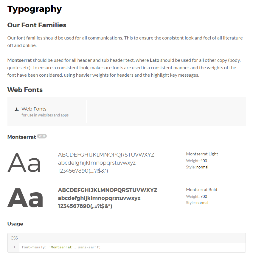
Example: Typography section of a web design style guide by Frontify
Leverage CSS Hero smart color picker tool
CSS Hero makes it easy to stay consistent with your colors even if you don’t have a web design style guide or your hex color codes memorized by heart.
CSS Hero Smart Color Picker tool stores your color selection whenever you edit the color of an element’s property and shows it again in your next color selection process. Over time, your whole palette will be saved in the Color Picker tool – so it will be a breeze to stick to your color scheme and keep your design consistent.
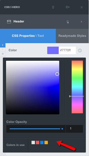
CSS Hero Smart Color Picker tool helps to stay consistent with your design
Easily replicate element styles
Ok, sticking to a consistent color palette is easy enough, since all the colors are saved within CSS Hero. But what about when you have edited multiple properties of an element with CSS Hero? How do you apply that styling consistently to other elements – without spending a lot of time on it?
Enter Cloning Styles feature (first introduced in CSS Hero 1.5 version). With this handy tool, you can selectively copy and paste element styles – yes, it’s as easy as it sounds.
Check out this one-minute video to see this feature in action. In a nutshell, you simply Copy Style from one element, then target a different element, and click Paste. Some properties get copied by default, and others you have to manually select to be copied.
Design mistake #2: Me-too branding
You know how you can almost tell when a WordPress site is using a popular theme? Without customization that leads to hundreds of sites looking like identical twins.
To stand out, you want to go beyond the fonts and color schemes that come with your theme. For brownie points, spy on the competition and instead of succumbing to me-too branding, find a way to be different while still staying true to your brand identity. Your design has to tell your story that will resonate with your audience.
Here are 2 ways to fix this branding mistake.
Explore and experiment!
Explore the other sites in your industry, and once you have gathered enough inspiration, start experimenting with your own design. CSS Hero makes it easy to customize any element of your site, so no need to keep your imagination on a short leash. Try out a few different color schemes or even a monochromatic design. Have fun with custom fonts. Style it up with CSS gradients or patterns.
And here’s another cool thing about using CSS Hero: Once you have put together a consistent look, you can save it as a Preset, and all of your current CSS customizations made with CSS Hero will be stored within the preset. Then, you can keep experimenting. If you create a completely different look, save it as another preset. Now that you saved the snapshots of your work, you can safely go back to your first preset. You can switch between the two. You can compare them in their entirety, and decide which one is more you.
See CSS Hero Presets in action on the video below.
Animate it
Animations engage your site visitors, reflect your brand’s personality and can take your design from me-too to unique. They create a mood – playful, mysterious, or welcoming.
Animations are still underused in web design – possibly because most site owners perceive them as something hard or tricky to code. However, with our point and click WordPress plugins CSS Hero and CSS Hero Animator, you can create fascinating animations on your site with no coding whatsoever. CSS Hero Animator doesn’t require CSS Hero, and you can use it on any WordPress Theme, absolutely FREE.
To get started, check out our tutorial on 5 classy CSS animations to make your WordPress site more engaging.
Design mistake #3: Poor use of color and contrast
Getting clear on your ideal colors and styles and using them consistently is only half of the deal. There also needs to be enough contrast between the colors or between the site background and elements on top of it. If the colors or imagery render the text unreadable or make your Call to action elements “invisible,” the site becomes hard to navigate and use.
Here’s how you can fix this design mistake.
Layer it!
Color blend, or image overlay, effects use two layers of visuals – the photo and a solid color or a gradient- and can create stunning imagery by combining the pixels laid on top of each other in different ways.
The addition of color instantly creates the desired mood (that stems from your brand personality and values) – energized and adventurous, playful party spirit, or relaxing mood. Image overlays also serve to increase the contrast between the background and the elements on top of it – like navigation, text, and call to action buttons.
Under a color overlay, even a busy image that you normally wouldn’t choose as a background turns into an effective way to convey your brand’s personality and story.
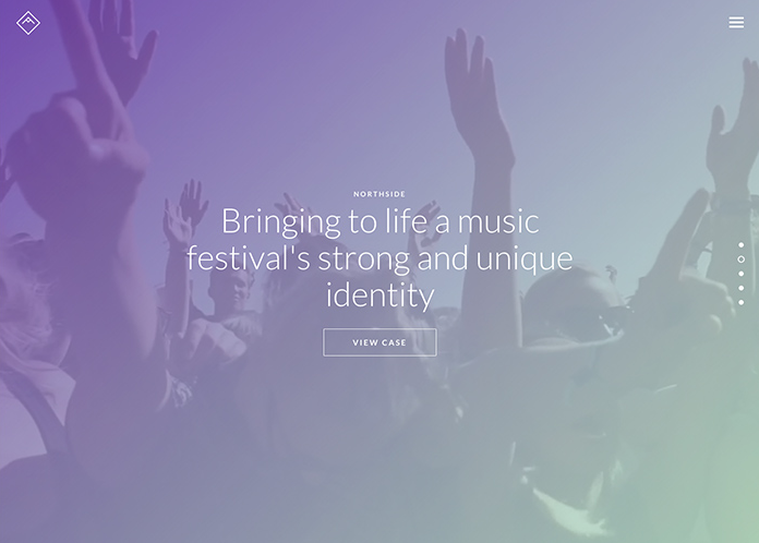
Use gradient image overlay to create a certain mood and increase contrast between the background and text
Here are the steps to adding an image overlay with CSS Hero:
- Target an element or a section of your site where you want to add an image overlay effect with CSS Hero
- Add a Background Image
- Pick a color (or a gradient)
- Set the Background Blend Mode to overlay
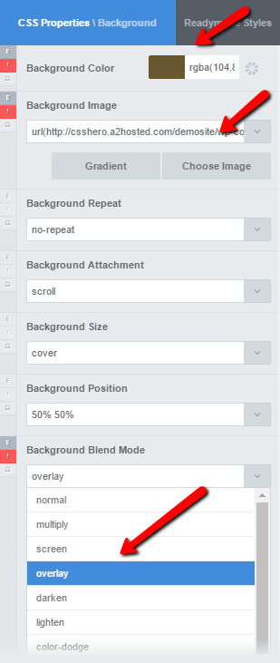
Add image overlay with CSS Hero
Go bold!
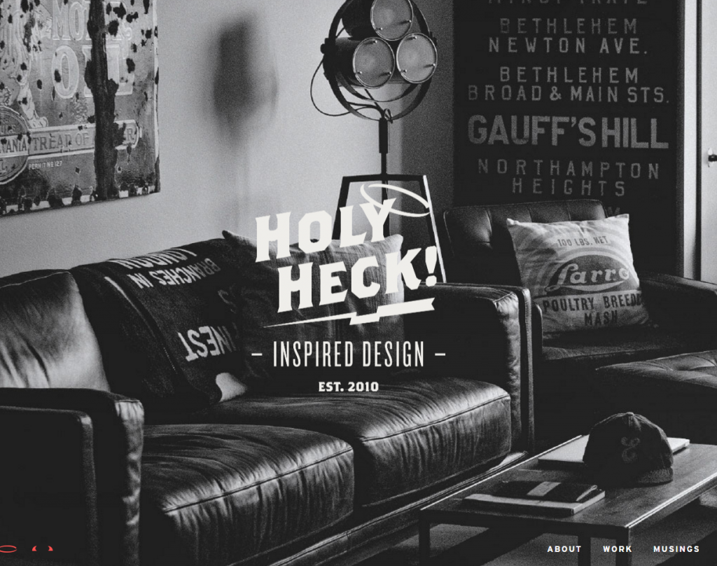
If the background image or color make your text hard to read, you can remedy it by using a bolder and bigger font.
For example, on the image below, if the title text wasn’t so large and bold, it would have been overpowered by the background image.
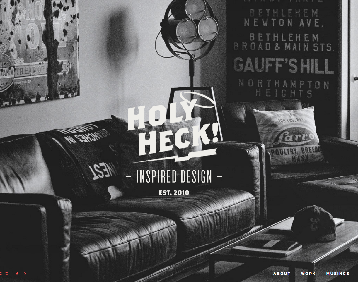
Bold, large-sized font makes this title stand out against the background
Not sure how to add a custom font to your WordPress site? Here you go, we have an easy-to-implement tutorial on it. And don’t forget to browse CSS Hero’s extensive selection of Google fonts.
You can always make a font bolder or bigger through CSS Hero Text properties menu. However, if you want to use a bold version of a custom font, make sure you load if first in CSS Hero.
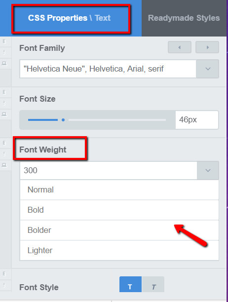
Make a font bolder or lighter with CSS Hero
Back to the basics
Finally, if you feel like playing with overlays and fonts still doesn’t deliver the desired level of contrast, it never hurts to go back to the basics and re-draw your color palette. There are plenty of online tools – such as Adobe Color CC shown below – that make applying the color theory a breeze and help you find attractive and contrasting color combos.
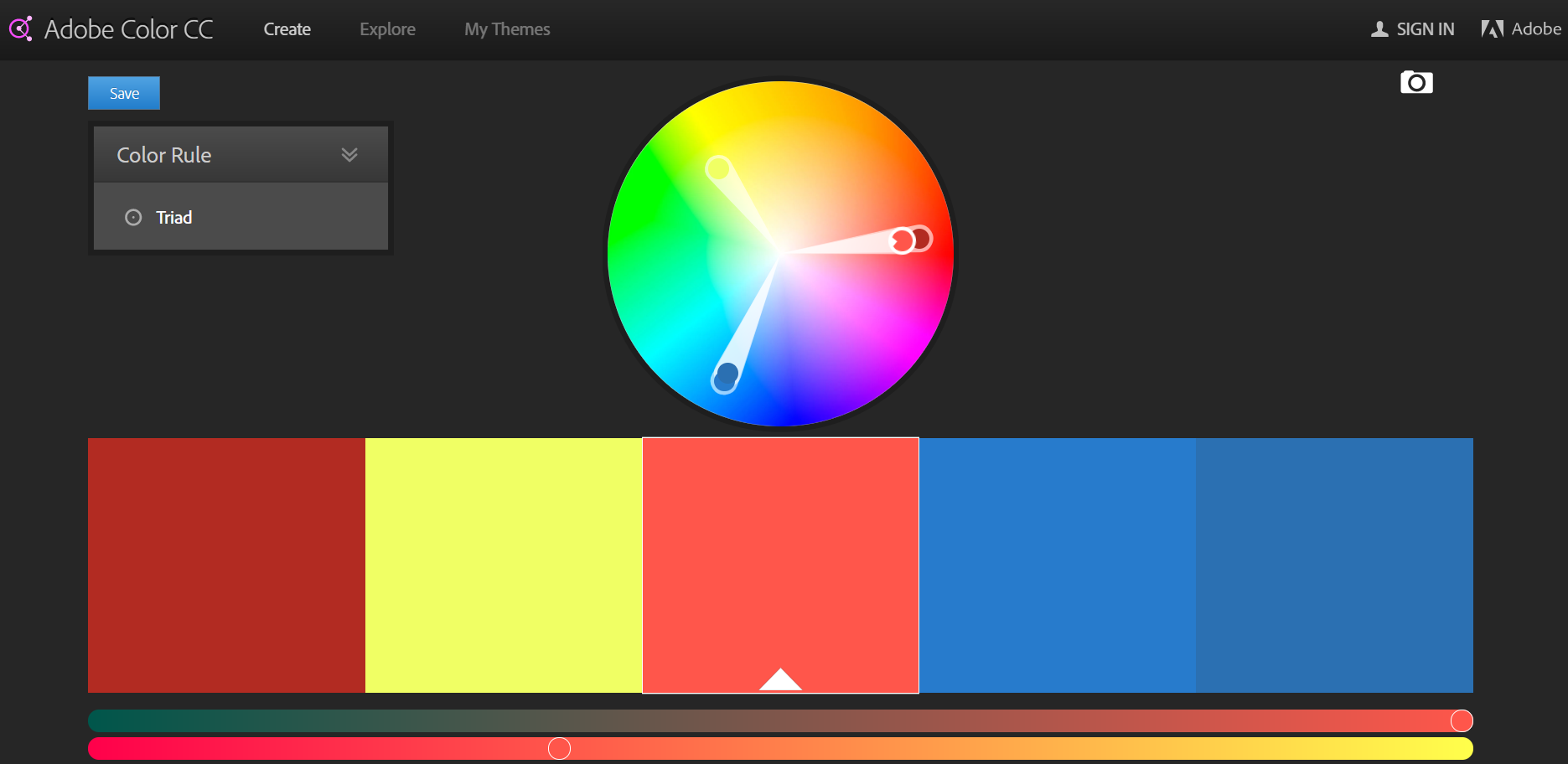
Generate a color palette with Adobe Color CC
Are you making any of these design mistakes on your site? What other branding and design blunders you are seeing around that we’ve missed? Tell us in the comments below.